Project Objective
To adapt brand assets and colours into patterns for a usable stationary line.
Target Audience
Tea and coffe drinkers with a love for handwritten notes, and nostalgic penpals.
Design Process
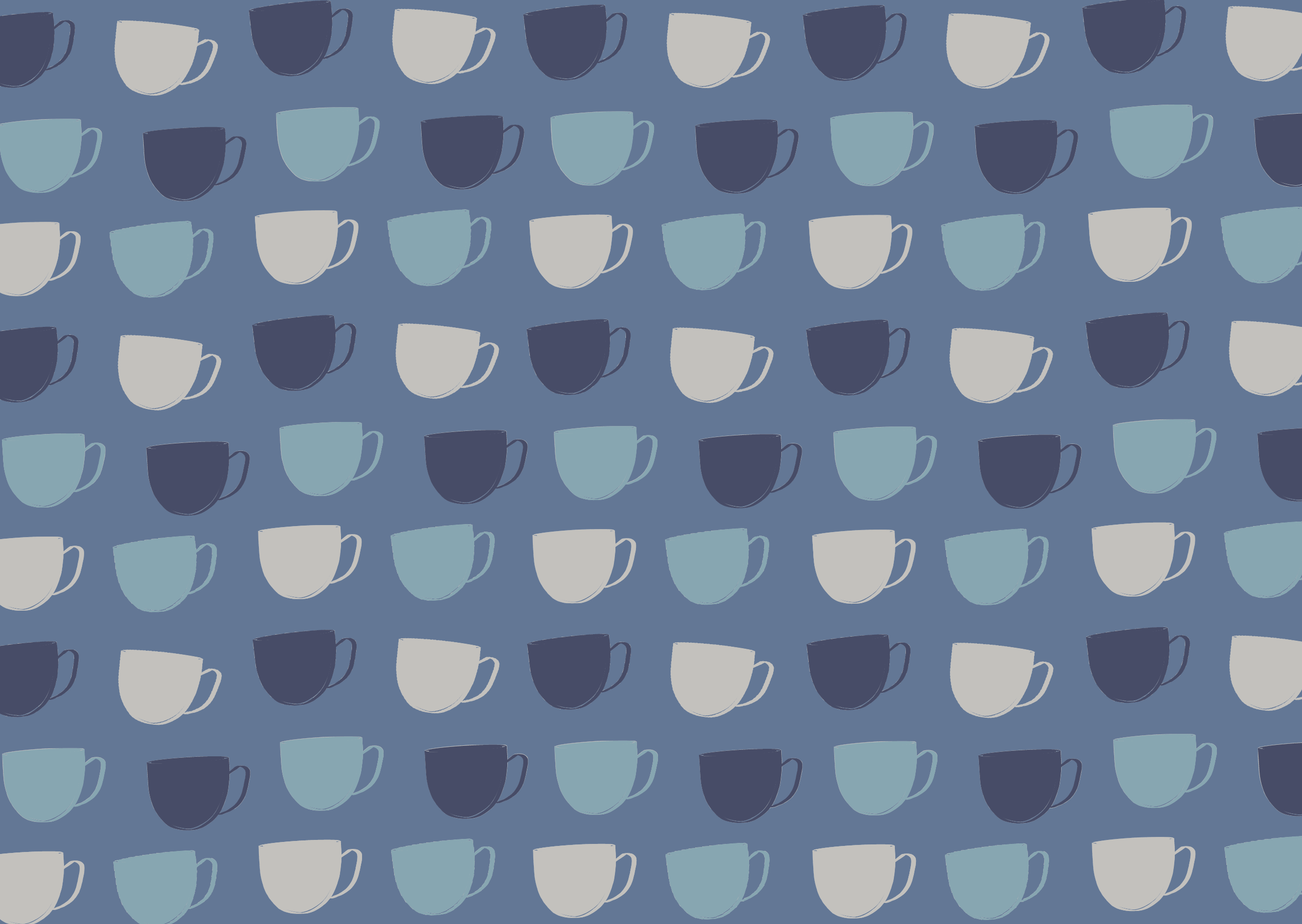
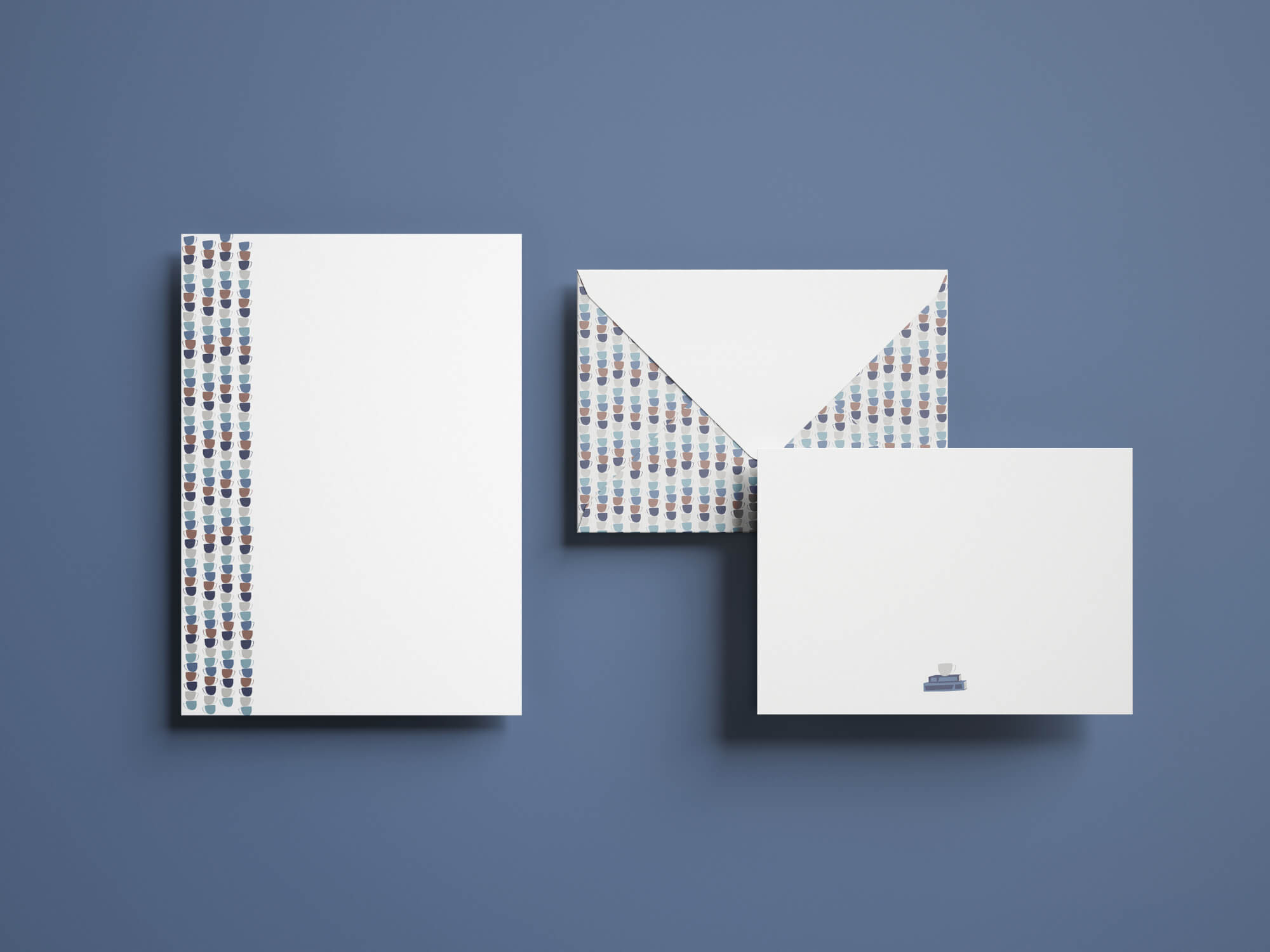
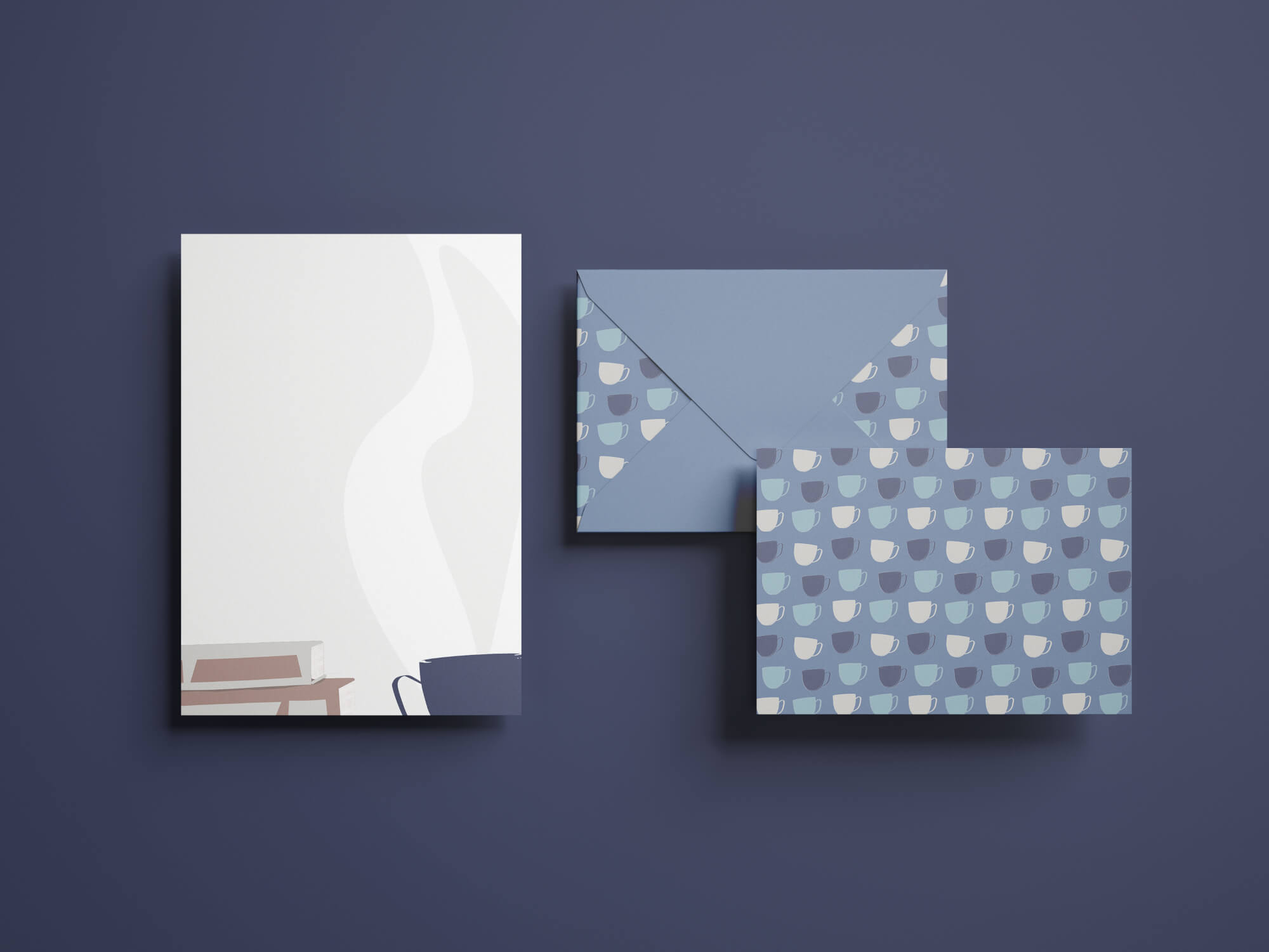
This project started with greeting card design concepts from a previous class using symbols and a limited colour palette to create interesting designs.
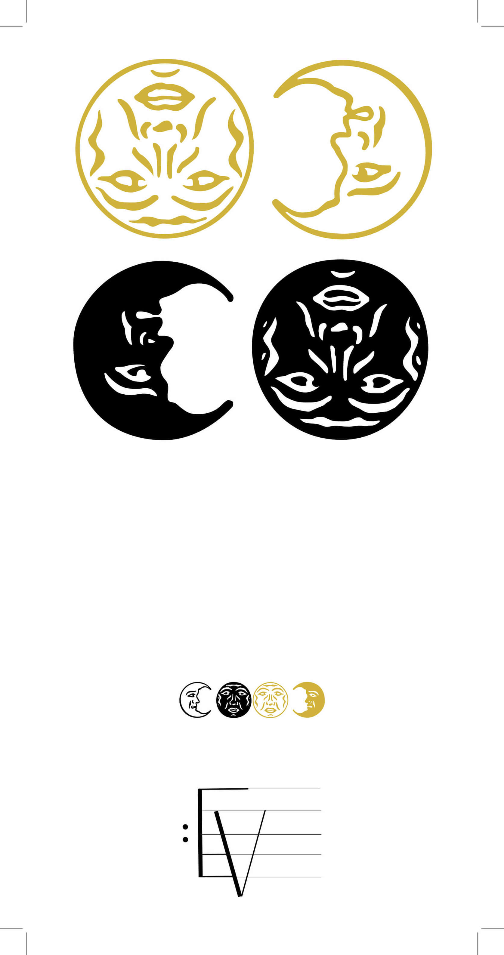
Upon recommendation from my professor, I merged these concepts with the personal brand assets I had developed that semester, in order to create a stationary line for my brand. The brand assets are hand-drawn to develop soft-edges and an approachable style. For the colour palette, I chose from a selection of photos that embodied the calm, soothing feeling of a cup of tea.

Design Challenges
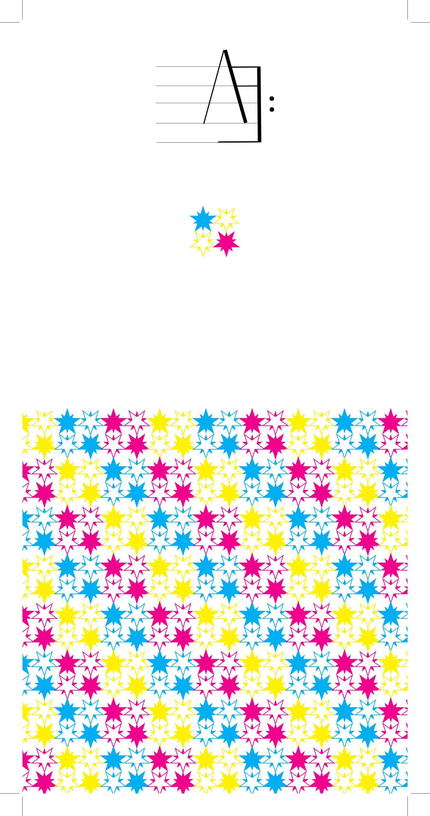
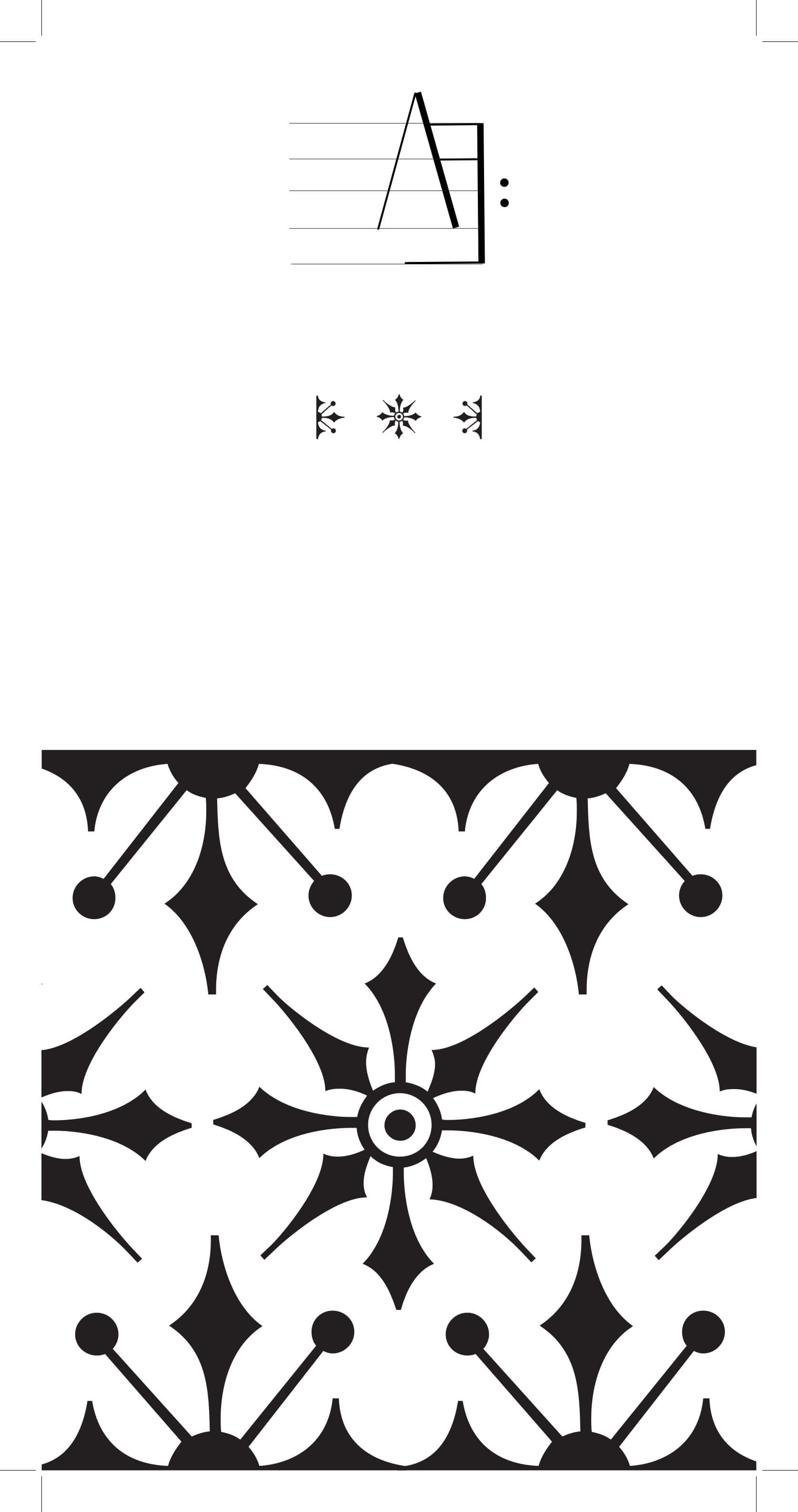
It was difficult to avoid clutter on the notepaper, while still incorporating enough assets to maintain the branded feel of the design. Patterned borders resulted in cheesy, outdated designs that needed to be reworked. Each design went through at least 3 iterations
Tools & Platforms
- Inkscape
- Adobe Creative Suite (Illustrator, Photoshop)
- Mockup Templates